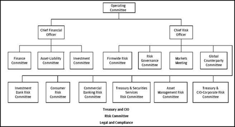
To those still clinging to the absurdity that Wall Street banks aren’t too complicated to manage, this flow chart that JPMorgan Chase filed today with the SEC as part of its quarterly financial report (10Q) should resolve the question.
This is the organization chart for the entity, the Chief Investment Office, that oversaw the loss of $5.8 billion in the first six months of the year at JPMorgan Chase, the country’s largest bank by assets. Imagine what the losses would have been if there were a few more departments on this chart.
If one compiled a chart of the siloed regulators overseeing JPMorgan’s sprawling global operations, it would look alot like this chart. Same for the mega law firms representing the more than 200 lawsuits against the firm. Same for the criminal and civil investigators digging into the firm’s conduct. More on that tomorrow.


